
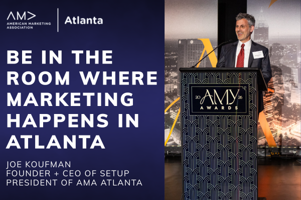
10 Inspirational Packaging Concepts

The dichotomy between functionality and beauty, and the yearning for simplicity while also being flashy enough to stand out from competitors is what makes Packaging an interesting industry. As much as we like to tout the phrase “Don’t judge a book by its cover,” a bad package can take a great product and make it seem less than. While humans are complex beings, they also are consumers…and consumers can often be visual creatures.
Throughout the years, iconic packages filled store aisles, and packaging techniques ranging from thought provoking to eye catching.
In preparation for PACK EXPO and immersing myself in the industry, I have scoured the internet looking for Packaging examples that deserve recognition because of their creativity, commentary, usefulness, and sheer awesomeness.
Below are ten examples of Packaging that stood out to me (in no particular order):
1 | Molocow UFO #Milk Concept packaging designed by Imedia Creative Bureau
This ad takes an extremely long standing design for milk receptacles and plays into a fanciful trope that cows are often abducted by aliens. It doesn’t seem like milk is going anywhere anytime soon, so how can a milk brand get eyes on them? Well, sex is not the only thing that sells, humor does too. The playfulness, creativity, and design of this packaging instantly makes it a favorite.
2 | Boston Pizza released a limited edition pizza box that’s designed for eating pizza in bed – designed by JOHN ST.
The best packages, like the best businesses, solve a problem. This pizza box designed for Boston Pizza takes a classic package and solves a unique, but relatable problem. Pizza is a food for all hours of the day, and Boston Pizza capitalized on the audience who enjoys spending a Saturday lounging on the bed, or a late evening snacking before calling it a night. I love the relatability, honesty, humor, and functionality of this packaging.
3 | Goldfish Tea Bags - Charmvilla
Sometimes a great package is released and I find myself thinking, “I can’t believe that hasn’t been done.” This goldfish tea bag from Charmvilla is not only purposeful, but adorable and charming. Why would I ever drink from an ordinary tea bag after experiencing something so visionary?
4 | Concept - Cupcake in the oven
“Cupcake in the oven” is a sweet example of how subtleties in packaging can influence a consumer. This clever nod towards how the cupcake inside was baked in an oven can convince a wary customer that the cupcake is fresh and potentially warm. This packaging is all about tapping into a consumer’s multiple senses to provide more information about the product.
5 | Help Remedies
Help Remedies is an example of how simplicity can often stand out in a world of vibrant and eye-catching marketing advertisements. The simple white background with text calls attention to the most important part of this product, which is how it will help you with whatever ails you. Sometimes it is more innovative to be simple, informative, and direct.
6 | Landmine Ketchup - Designed by Publicis Mojo
Packaging, just like any other marketing campaign, can bring awareness to hard topics. Publicis Mojo created a simple design mixed with ketchup’s red blood color to instantly bring the tragedies caused by landmines to mind. I appreciate the packaging’s shocking, upfront, insightful, and clever approach.
7 | Paper Bag Looks Like A Case Of Beer Bottles Of Bulgarian Beer Brand Shumensko
This beer brand wanted customers to recognize their product and accomplished this by using iconic packaging in a playful advertisement. You may have noticed by now, but I love an approach that is unique and makes you stop in your tracks.
8 | Tiffany & Co. blue box
These last few packages will need little introduction. Sometimes a package doesn’t have to be unique in its design, or funny commentary, or even focus on the product inside to be noted as iconic. Tiffany & Co.’s blue bags and boxes have become synonymous with the brand. The bold color is different from other jewelers who package their products in black boxes or white bags.
9 | Pringles Can
Pringles is an example of stellar packaging due to its recognition. Traditionally, potato chips come in a bag. Pringles went way outside the box when designing their tall cans. Not only does this package pop out at you on shelves among dozens of bags vying for attention, but it also provides more clarity to the consumer. You know exactly what you’re getting, how much (instead of a bag full of air), and the size of the chip.
10 | McDonald’s Happy Meal
This iconic piece of Americana is firmly rooted in the minds of people both young and old. The self-contained and excitingly colored box appeals to children in a way that food on a tray doesn’t. It’s theirs - that sense of ownership is what we think has helped the Happy Meal stand the test of time.
Packaging can make or break a purchase. Knowing your audience and what matters to them, whether that be artistic creative, functionality, or taking a stand, will help inform a brand’s packing decisions. Based on this blog, I know I gravitate towards more thought-provoking, humorous pieces.
If you enjoyed this blog, we regularly post opinion pieces like this one, in addition to interviews by marketing leaders, industry updates, and more. Subscribe to the newsletter below to get the latest scoop!


In this episode, Madeline Evans, the Marketing Manager at Setup, interviews John Mangan, the Director of Marketing for Big Brothers Big Sisters of Atlanta, about Disney, purpose-driven marketing, using a sales mindset in marketing efforts, and more.